by Dustin

Welcome to the newly revamped Collectors Corner. We’re going to be transitioning from speaking about multiple albums at a time, to a more in depth look at unique individual releases. A bit of discussion of some of our personal favorites from our collections. I’m a big fan of creative packaging when it comes to albums. In an era where digital is becoming the norm, an act going the extra mile with design can be the difference maker when it comes to putting out the extra cash for a physical copy. It can be particularly attention grabbing when it’s an unconventional CD release. CD can be a pretty boring piece of media at face value. Standard jewel cases feel incredibly sterile; even digipaks can seem uninspired, regardless of the fact that they tend to be better looking than plastic casing.
Today we will be having a look at one of these extra cool albums, clipping.’s 2014 record CLPPNG. Released on Sub Pop Recordings, catalogue number SP1071, in compact disc format.

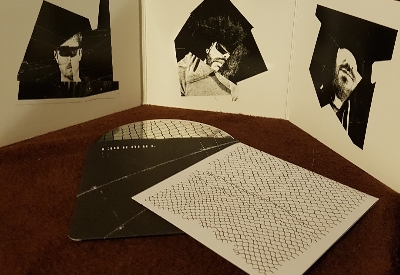
When I ordered my copy of this record, I had very little idea of what to expect. It was around the time I had first started my music collection, and all I knew was that I dug the album. When the parcel came in the mail and I finally got my hands on it I could not have been more pleasantly surprised. Upon opening the tri-fold outer casing, you’re greeted with very creatively edited pictures of all three members of the group in a very pleasing black and white. The print quality is high, leaving all of the artwork looking well defined and clear. The cardboard itself is incredibly thick and has a slick finish. It feels quite durable, and the corners don’t seem to be quite as prone to breaking down as you might expect from a digipak. Overall, I am a fan of CLPPNG’s outer package. It’s not a groundbreaking design by any means, but it’s cleanly put together and tastefully minimalistic. This creates a kind of contrast with clipping.’s noisy and chaotic music that I thought was quite clever.
That aside, there are some internals to discuss as well. The two outer segments of the tri-fold digipak are hollow and have some goodies to look at. One contains the credits booklet, and the other contains the disc itself.
The credits booklet was a necessary addition, but it is not overly substantial. It contains song names and additional credits that aren’t listed on the digipak tracklist. I would have liked to see a lyric booklet, or possibly some more photos of the group in a style similar to those in the tri-fold; however, the rest of the packaging is relatively minimalistic and this does fit that style. It felt more like a reference sheet, but it still looks really nice; moreover, there are some interesting tidbits as far as minor vocal credits that will appease the super-fan curious about all details of any given song.
The CD is probably the most interesting part of the album packaging in my opinion. The artwork on the disc is just a minor reworking of the album cover, but the real showstopper is how it is stored inside the digipak. Rather than clicking into a plastic holder or just slipping inside the case, the disc is wrapped in a paper dust cover very reminiscent of those you would find in a vinyl release. This protective sleeve even has a bit of a design on it that pairs up nicely with the album artwork. It’s such a small little thing, but it turns a cool tri-fold digipak into something special. Given my own personal preference for vinyl (as well as its resurgence in recent years), it just felt really awesome to open up a CD that takes influence from that style of packaging. Vinyl is expensive, and having a more affordable option such as this offering part of the same tactile experience is fantastic.
As far as sound quality goes, it’s a CD so there aren’t really any surprises. CD doesn’t tend to have the variability in terms of sound quality compared to vinyl pressings, and CLPPNG is no exception to that. It sounds great, but it offers no benefit when compared to the digital version of the album (particularly if you have the album in a 320kbps mp3 or lossless format). This release isn’t a must for audiophiles, and lends itself much more to those who simply love collecting physical music.
Ultimately, the CD version of CLPPNG is well worth buying if you’re a fan of the release. I would have personally preferred the vinyl, but I would be lying if I said this wasn’t unique. The assembly and design of the packaging are both superb, well above the average I would hold against compact disc. Though I do have a few deluxe editions and short run releases from other artists that I like more, this is probably one of my most cherished standard versions of an album in this format that I own. Time and time again I find myself smiling when I open up the digipak to give the record a playthrough. There’s just something about the minor details that make CLPPNG feel like something special. I recommend it fully for the avid music collector.


