Collectors Corner: Madvillain – Madvillainy (2014 Cassette Reissue)

by Dustin

cctitle

Ever since we decided to revitalize the Collector’s Corner series of articles back in January, I’ve been racking my brain in an attempt to decide on the next album to showcase. I quite enjoy being able to talk about some of my favorite releases more casually and personally, as opposed to the formal nature of music reviews; however, physical media is not always the most interesting thing in the world. I adore my music collection, and have a bad tendency to put disposable income I don’t actually have into it. Regardless of this, many of the titles I own could be described in a paragraph or less. This simplicity is a wonderful thing, but at the same time it doesn’t make for the most catching of blog posts; however, Rajin recently published his own collectors corner, reminding me not to neglect this particular series. Being the stubborn person I am, I figured the best way to break the slump would be to write about one of the most simplistic releases I own. This may sound counterintuitive, but due to the album’s stature within hip-hop and grandiose sound I actually find the stark contrast quite interesting.

The album in question is Madvillainy, the collaborative effort between underground legends MF DOOM and Madlib under the name Madvillain. The particular version we will be looking at is the cassette re-release which came out under Stones Throw Records (STH2065) in 2014. This is the standard release, which has some minor changes from the Cassette Store Day release though they share the same catalogue number. The biggest variation is that the Cassette Store Day release has a shiny j-card rather than matte.

doom1

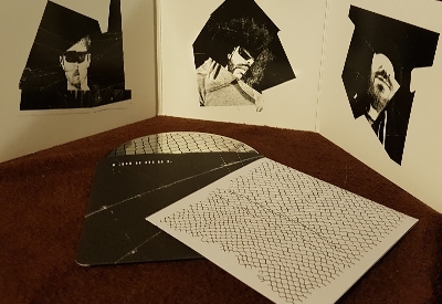
Upon first look at this cassette it is evident that a few minor design changes were made to the original cover in order to have it look natural on a j-card. The text from the upper left corner has been removed entirely, and the orange square on the right has been trimmed into a much smaller strip. These alterations don’t take much away from the artwork, and in my opinion Stones Throw did an excellent job reformatting everything. One weird difference, however, is that the signature cover photo of DOOM appears to be slightly darker than on the original. This could just be an illusion due to the fact that his shoulders have been cut out, but it stood out as slightly odd to me. Ultimately it doesn’t really matter, as the album artwork is classic and looks just about as good here as it has anywhere else. I’ve seen cassette release adaptations go really poorly, and fortunately Madvillainy is not one of those cases.

The rest of the j-card is also quite minimalistic. Taking a look at the side spine you’ll find the album name and not much else. Around the back it simply says that group is called Madvillain, Madlib did the beats, DOOM did the emceeing, and Stones Throw released the record (in addition to the catalogue number). This serves as the credits portion of the release, weighing in at a whopping eight words. The interior of the j-card has a black and white photo of Madlib with his face partially obscured by a piece of production equipment. That is essentially all there is to see as far as the external packaging goes. It’s basic, but it looks great.

doom2

The cassette itself seems barren (even under-designed) at first, but after taking a closer look at it I realized it is actually quite the unique piece. The tape is housed inside a colourless clear shell with black liners, which in itself does not sound like anything particularly out of the ordinary. If you take a closer look at the liner though, there is a triangular notch cut out of the top which is a shape that I have never personally seen on a cassette before. The black liner is also being used to provide a contrasting backdrop to the white text stamped on both sides of the outer shell, and makes the font pop excellently. It’s a very small design choice, but it adds a sense of flair that would not have otherwise been there. I personally adore it.

The sound quality is about as good as you’re going to get from a cassette, which still isn’t amazing, but it’s certainly passable. I noticed relatively little background hiss, which doesn’t seem to be a frequent issue on newer cassettes anyway. The quality control is appreciated nonetheless.

To summarize, the 2014 cassette reissue of Madvillainy is an exercise in minimalism done correctly. The aesthetic offers few clues as to how the album is going to sound, yet it also compliments the music very well. This particular album always seemed to suit the vinyl format the most, but I will say that I was pleasantly surprised with the cassette. If you’re interested in picking up one of the many reissues (as of right now Discogs lists 23 versions) of Madvillainy, I would most certainly say that you can’t go wrong with this tape.

Collectors Corner: UGK – Too Hard To Swallow (2017 Vinyl Reissue)

by Rajin

cctitle

Last year marked the 25th anniversary of UGK’s debut album Too Hard To Swallow. To celebrate, Get On Down Records released a special reissue for Record Store Day, limited to 1,000 copies. Previously only released on CD and cassette, this was the first time the seminal Dirty South album was pressed on vinyl (aside from a 1992 promotional only pressing which wasn’t for public sale).

This was one of the first records I bought after getting into vinyl at the top of this year. On my first trip to the record store I saw it while flipping through hip hop records, but for some reason I didn’t think to pick it up. No more than a few days later I was idly reflecting on that visit, and decided to look this album up on Discogs. Upon doing so, I read details about it that made me realize the mistake I had made in passing it up. About a week later I went back trusting that if it had stayed on the shelf for 8 months, it would still be there. Sure enough, it was, and I went home with what remains to be the coolest vinyl I own as of now.

download_20180521_132441

The first thing that you’ll notice about the record is the way the cover art has been altered. Pimp C, Bun B, and the lettering are all gold, and essentially everything else is dark blue. I’m not entirely sure why the cover has been altered the way it has, and I don’t really know how I feel about it. While I don’t remember if it was the only reason I didn’t pick it up at first, the changes were definitely part of why I was apprehensive. I imagine I thought I would find an earlier pressing with the original cover, only to find out that this is the first vinyl pressing. I will say, it gives the cover a sleeker look than the original. It looks more like an actual album cover, and less like a picture with word art on it; however, it does eliminate the charming simplicity and overall “Dirty South” vibe that the original album art had.

download_20180521_132443

The record sleeve is a little thinner than I personally prefer for a 2xLP. There are no inserts or anything to speak of; the credits are all listed on the back cover, which follows the same color scheme as the front cover. There really isn’t anything else to the packaging. The actual vinyl is where the release gets more impressive to me. It was pressed on clear vinyl, which makes it one of the more aesthetically pleasing records that I own. I really like how you have a view of the grooves that you don’t get on other colors. Not only does it look extremely cool, it makes it much easier to see whether the record is dirty or not. The colors used on the sleeve are also used on the vinyl labels, which actually serves as a gorgeous contrast to the clear vinyl.

The pressing itself is a pretty good one. I’m no audiophile, so perhaps others who have listened to it would dispute me on this, but I love how full the funky, syrupy bass on this record sounds. Tracks with slower and more detailed production like “Feel Like I’m The One Doing Dope” become infinitely more immersive than the digital version is. The vocals also sound great, and honestly better mixed than they were on the original release. Bun B’s booming voice in particular sounds great on this pressing.

Ultimately, the best thing about this is that a classic album has finally gotten the vinyl pressing it always deserved. Too Hard To Swallow was already an album that anyone who considers themselves a fan of hip hop should own, but this pressing is special. If anyone sees it hanging out at your record store, pick it up. Don’t even think about it.

Collectors Corner: clipping. – CLPPNG (Standard CD Release)

by Dustin

cctitle

Welcome to the newly revamped Collectors Corner. We’re going to be transitioning from speaking about multiple albums at a time, to a more in depth look at unique individual releases. A bit of discussion of some of our personal favorites from our collections. I’m a big fan of creative packaging when it comes to albums. In an era where digital is becoming the norm, an act going the extra mile with design can be the difference maker when it comes to putting out the extra cash for a physical copy. It can be particularly attention grabbing when it’s an unconventional CD release. CD can be a pretty boring piece of media at face value. Standard jewel cases feel incredibly sterile; even digipaks can seem uninspired, regardless of the fact that they tend to be better looking than plastic casing.

Today we will be having a look at one of these extra cool albums, clipping.’s 2014 record CLPPNG. Released on Sub Pop Recordings, catalogue number SP1071, in compact disc format.

clipping
The front cover of CLPPNG.

When I ordered my copy of this record, I had very little idea of what to expect. It was around the time I had first started my music collection, and all I knew was that I dug the album. When the parcel came in the mail and I finally got my hands on it I could not have been more pleasantly surprised. Upon opening the tri-fold outer casing, you’re greeted with very creatively edited pictures of all three members of the group in a very pleasing black and white. The print quality is high, leaving all of the artwork looking well defined and clear. The cardboard itself is incredibly thick and has a slick finish. It feels quite durable, and the corners don’t seem to be quite as prone to breaking down as you might expect from a digipak. Overall, I am a fan of CLPPNG’s outer package. It’s not a groundbreaking design by any means, but it’s cleanly put together and tastefully minimalistic. This creates a kind of contrast with clipping.’s noisy and chaotic music that I thought was quite clever.

That aside, there are some internals to discuss as well. The two outer segments of the tri-fold digipak are hollow and have some goodies to look at. One contains the credits booklet, and the other contains the disc itself.

clipping2
A look at the internals of the packaging.

The credits booklet was a necessary addition, but it is not overly substantial. It contains song names and additional credits that aren’t listed on the digipak tracklist. I would have liked to see a lyric booklet, or possibly some more photos of the group in a style similar to those in the tri-fold; however, the rest of the packaging is relatively minimalistic and this does fit that style. It felt more like a reference sheet, but it still looks really nice; moreover, there are some interesting tidbits as far as minor vocal credits that will appease the super-fan curious about all details of any given song.

The CD is probably the most interesting part of the album packaging in my opinion. The artwork on the disc is just a minor reworking of the album cover, but the real showstopper is how it is stored inside the digipak. Rather than clicking into a plastic holder or just slipping inside the case, the disc is wrapped in a paper dust cover very reminiscent of those you would find in a vinyl release. This protective sleeve even has a bit of a design on it that pairs up nicely with the album artwork. It’s such a small little thing, but it turns a cool tri-fold digipak into something special. Given my own personal preference for vinyl (as well as its resurgence in recent years), it just felt really awesome to open up a CD that takes influence from that style of packaging. Vinyl is expensive, and having a more affordable option such as this offering part of the same tactile experience is fantastic.

As far as sound quality goes, it’s a CD so there aren’t really any surprises. CD doesn’t tend to have the variability in terms of sound quality compared to vinyl pressings, and CLPPNG is no exception to that. It sounds great, but it offers no benefit when compared to the digital version of the album (particularly if you have the album in a 320kbps mp3 or lossless format). This release isn’t a must for audiophiles, and lends itself much more to those who simply love collecting physical music.

Ultimately, the CD version of CLPPNG is well worth buying if you’re a fan of the release. I would have personally preferred the vinyl, but I would be lying if I said this wasn’t unique. The assembly and design of the packaging are both superb, well above the average I would hold against compact disc. Though I do have a few deluxe editions and short run releases from other artists that I like more, this is probably one of my most cherished standard versions of an album in this format that I own. Time and time again I find myself smiling when I open up the digipak to give the record a playthrough. There’s just something about the minor details that make CLPPNG feel like something special. I recommend it fully for the avid music collector.

Collectors Corner: Sean Price, Raekwon, and Joey Bada$$.

by Rajin

cctitle

Not long ago, I was marveling at my hilariously shrimpy CD collection and decided to take it upon myself to revive this very dead section of the site. I’ve got a few items that I thought would be cool to share, both today and in the future. I figured this was also as good a way as any to give my thoughts on newer albums that I liked but didn’t review for one reason or another. Hopefully we can start this section back up with more regular drops, but without further ado, here are the items I felt like sharing.

d31098d0ee8447aa55adec62667ce5a9

First up is the Gorilla Box Set, by the late, great Sean Price. After the unfortunate and untimely passing of Sean Price, Duck Down reissued all three of his studio albums (Monkey Barz, Jesus Price Supastar, and Mic Tyson), packaging them together to make this box set. It was released in for both CD and vinyl. As you can see, this is the CD version. It’s got a lenticular cover depicting what seems to be the scene immediately preceding the image you see on the Mic Tyson cover.

Artwork from each album is shown on each of the three side panels of the box, and the back cover shows an illustration of Sean sitting at a campfire. The CDs come in jewel cases, which is something I’m actually sort of relieved about, because from what I’ve seen before CD box sets often use cheap slimline digipacks/cardboard sleeves.

4f761e657a799103d8682eb3678a4812

Next up is the CD for Raekwon’s latest album, The Wild. Both Dustin and I were in agreement when we listened to this album on Spotify about how silly the album cover looked. It was like a less kickass rendition of the Mic Tyson cover. However, seeing it in the physical changes things entirely. The illustration seems far clearer and less cluttered in print than it is on a computer screen. Overall the packaging is kept simple. There isn’t even a booklet. It’s just a front flap that opens to the CD. That’s fine for me though, for the most part. I’m a sucker for digipak.

This is probably the best non-Cuban Linx album that Rae has released. Rae managed to create an album where he made boom bap sound radio-ready in the current state of hip hop, which is quite impressive. While most of the songs are nothing out of the ordinary for Raekwon at this point in his career, it’s a very enjoyable album that I think will serve as an easily accessible entry point for newer hip hop fans to use in order to get into his style and catalog.

ece12d7261a53c5cc95281c22c841c66

And lastly, we have the CD for Joey Bada$$’s new album, All-AmeriKKKan Bada$$. On his last album and mixtapes prior to that, Joey established himself as a new school artist who was making gritty boom bap music reminiscent of early Nas, Black Moon, and Smif-N-Wessun. Here, however, he steps out of his comfort zone, using production that is generally jazzier and lighter. He uses this album to express his confusion and, at times, anger, about having to grow up as a young black man in the current climate of America. He seems to come into his own on this album – it is his best release to date, to me.

The CD comes in a sleeve that depicts the American flag made of bandanas. This was the image that he had originally led people to believe was the cover art. It was a cute fakeout, I like the design so I wouldn’t have been mad if it happened. The actual cover is (to my knowledge) an impromptu pose that Joey made on the set of his “Devastated” video. It gives off a sense of carefree recklessness that I think actually betrays the most of the music on the album. I don’t think it fits the overall mood of the album, but the scenery of dirt roads in the middle of nowhere does a good job at portraying Joey as an outlaw, which I assume was the point.

Collectors Corner: Meme Vivaldi, clipping, and Offsite & Wontu.

by Dustin

cctitle

Welcome to the Collectors Corner, a new article series on Extraordinary Nobodies where we will be taking a look at physical media from all sorts of record labels and artists. Most of these will be coming from my own collection, but my (kind of) wonderful co-writer Apu will also be contributing from his assortment of music on occasion. Collectors Corner will be a little more relaxed (and a little less hip-hop focused) than some of our other articles, serving as break from the usual… Mostly for myself, but I’m sure variation in content is healthy, right?

Primarily, I just thought it would be fun to spotlight some of the cool and weird physical releases that constantly pop up in the music scene. We’ll also get the chance to throw in some mini-reviews of albums we otherwise wouldn’t have the time to review… Wow, this is great, right? Right?!

Now, let’s just jump right into the first batch of albums in the collectors corner spotlight:

memev

From Poor Little Music, an underground Canadian label that deals primarily in cassette and floppy disk (yes, you’ve read that right) releases, I picked up Meme Vivaldi’s Smile on tape. The art on the packaging itself is really nice. There’s something about it that I found to be somewhat vaporwave inspired, particularly on the inside of the j-card insert. The cassette itself is a brilliant orange, and features a sticker rather than stamping.

Smile basically sounds like the soundtrack to an artificial intelligence having a mental breakdown. It is an incredibly odd little electronic album, but it’s also a lot of fun. I hadn’t personally heard Smile when I purchased it (yay, impulse buys), but I was pleasantly surprised once I got a chance. The sounds here definitely aren’t for everyone, but those looking for a mind-fuck will probably enjoy it.

Smile is also a limited edition of 30, so if you’re looking to own a cassette you may want to get on that soon. Hell, they could already be sold out by the time you read this. Sorry.

clippin

From SubPop Records and Deathbomb Arc, I also picked up the cassette version of clipping.’s Splendor & Misery. There were a few different physical media options for this album, but ultimately I ended up going with the cassette because the packaging is gorgeous. The cassette itself is wonderfully industrial looking, coming coloured in a clean light gray.

The insert has a very classy foil look to it, complimented by a retro feel to the rest of the packaging. This is very honestly one of the nicest looking cassette releases I’ve seen this year and I would fully recommend it to anyone looking to add to their collection. Plus, something about listening to glitched-out experimental hip-hop on cassette just feels right… And that is the most pretentious sentence I will ever write in my life.

Splendor & Misery is one of my absolute favorite releases this year; you can read more about my thoughts on this album in my full-length review.

offsitewontu

Third is Offsite & Wontu’s collaborative effort After Shenron. This album comes via Every Dejavu. The packaging on this tape is a really an aesthetic treat. From the incredible blue colour on the casing itself, to the beautiful album art. It looks great in my collection, but more importantly it is also a wonderful little project musically.

The production and rapping, are a very chill alternative brand that fans of rappers such as Open Mike Eagle and milo will certainly enjoy. After Shenron is short, but it feels like it packs enough content to sink your teeth into.